
css3神奇的圆角边框、阴影框及其图片边框
2020-02-02 16:01:10来源:博客园 阅读 ()

css3神奇的圆角边框、阴影框及其图片边框
css3圆角,建议IE10以上
如果border-radius 单位是百分比,则参考为自身宽高,因此当宽高不一致时,圆角为不规则形状
如果border-radius 为50%,则为椭圆;当宽高一致时,则为正圆
单独设置每个圆角:
四个值: border-radius:左上角 右上角 右下角 左下角
三个值: border-radius:左上角 右上角+左下角 右下角
两个值: border-radius:左上角+右下角 右上角+左下角
兼容浏览器前缀
谷歌 -webkit-
火狐 -moz-
IE -ms-
欧朋 -o-
气泡对话框
<!DOCTYPE html>
<html lang="en" manifest="index.manifest">
<head>
<meta charset="UTF-8">
<title>Document</title>
<style>
    div{
        width:500px;
        height:300px;
        border:1px solid #000;
        position: relative;
        font-size:24px;
        line-height: 300px;
        text-align:center;
        -webkit-border-radius:50%;
           -moz-border-radius:50%;
            -ms-border-radius:50%;
             -o-border-radius:50%;
                border-radius:50%;
    }
    div::before,
    div::after{
        content:'';
        display: block;
        position: absolute;
        border:1px solid #000;
        -webkit-border-radius:50%;
           -moz-border-radius:50%;
            -ms-border-radius:50%;
             -o-border-radius:50%;
                border-radius:50%;
    }
    div::before{
        width:50px;
        height:50px;
        right:50px;
        bottom:-25px;
    }
    div::after{
        width:30px;
        height:30px;
        right:25px;
        bottom:-50px;
    }
</style>
</head>
<body>
    <div>这是一段气泡对话框</div>
</body>
</html>

box-shadow:水平偏移 垂直偏移 模糊 扩展 颜色 位置
<!DOCTYPE html>
<html lang="en" manifest="index.manifest">
<head>
<meta charset="UTF-8">
<title>Document</title>
<style>
    div{
        width: 300px;
        height: 200px;
        background-color: #f0f;
        margin:0 auto;
        box-shadow:10px 10px 5px 0 #bbb;
    }
</style>
</head>
<body>
    <div></div>
</body>
</html>

border-image 欧朋浏览器和IE浏览器不兼容
首先准备border.png

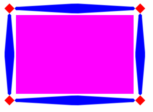
演示效果1:
图片铺满整个边框
<!DOCTYPE html>
<html lang="en" manifest="index.manifest">
<head>
<meta charset="UTF-8">
<title>Document</title>
<style>
    div{
        width: 300px;
        height: 200px;
        background-color: #f0f;
        margin:0 auto;
        border:30px solid black;
        border-image:url(source/border.png) 30 30 round;
    }
</style>
</head>
<body>
    <div></div>
</body>
</html>

演示效果2:
图片被拉伸来铺满边框
<!DOCTYPE html>
<html lang="en" manifest="index.manifest">
<head>
<meta charset="UTF-8">
<title>Document</title>
<style>
    div{
        width: 300px;
        height: 200px;
        background-color: #f0f;
        margin:0 auto;
        border:30px solid black;
        border-image:url(source/border.png) 30 30 stretch;
    }
</style>
</head>
<body>
    <div></div>
</body>
</html>
原文链接:https://www.cnblogs.com/chenyingying0/p/12252018.html
如有疑问请与原作者联系
标签:
版权申明:本站文章部分自网络,如有侵权,请联系:west999com@outlook.com
特别注意:本站所有转载文章言论不代表本站观点,本站所提供的摄影照片,插画,设计作品,如需使用,请与原作者联系,版权归原作者所有

上一篇:CSS3结构类选择器补充
- ie8下透明度处理 2020-06-11
- CSS3 2020-06-05
- css:css3(圆角边框、盒子阴影、文字阴影) 2020-06-05
- 2.CSS3选择器 2020-05-17
- 1.CSS3简介 2020-05-17
IDC资讯: 主机资讯 注册资讯 托管资讯 vps资讯 网站建设
网站运营: 建站经验 策划盈利 搜索优化 网站推广 免费资源
网络编程: Asp.Net编程 Asp编程 Php编程 Xml编程 Access Mssql Mysql 其它
服务器技术: Web服务器 Ftp服务器 Mail服务器 Dns服务器 安全防护
软件技巧: 其它软件 Word Excel Powerpoint Ghost Vista QQ空间 QQ FlashGet 迅雷
网页制作: FrontPages Dreamweaver Javascript css photoshop fireworks Flash
